Why Color Is the Secret Weapon of Luxury Kitchen Design
When most people think about making a kitchen look expensive, their minds jump to marble countertops, custom cabinetry, or high-end appliances. But seasoned interior designers know a more accessible secret: color does the heavy lifting. The right shade on your cabinetry or walls can transform an ordinary kitchen into a space that feels bespoke, considered, and quietly luxurious — without a full renovation budget.
As we move deeper into 2026, kitchen color trends are evolving significantly. The era of playing it safe with flat, one-size-fits-all neutrals is giving way to richer, more characterful palettes. Designers are reaching for colors with depth, heritage, and personality — shades that tell a story and make a room feel truly lived in rather than freshly templated. If you are planning a kitchen refresh this year, these are the five colors worth knowing about.
1. Rich Burgundy Red: Warmth With Authority
Burgundy is staging a bold and confident comeback in 2026, and for good reason. This deep, wine-inspired shade carries centuries of design history with it, evoking the richly painted furniture found in traditional English country house kitchens. Far from feeling dated, contemporary applications of burgundy feel grounded, warm, and genuinely sophisticated.
A perfect reference point is deVOL's Refectory Red, a heritage-inspired paint color that lends cabinetry an almost ancestral gravitas. It is rich and enveloping without crossing into overwhelming, striking the exact balance needed to make even simple shaker-style furniture feel more refined and substantial. The key to making burgundy work is pairing it with the right materials. Think black granite, aged slate, dark timber, and brushed brass or antique brass hardware. These combinations create the kind of layered, textural luxury that is typically associated with high-end historic interiors.
Burgundy works particularly well in kitchens that receive warm, directional light, where the depth of the color can really breathe and shift throughout the day. If your kitchen skews cooler in tone, consider using burgundy on lower cabinetry only and keeping uppers lighter to maintain balance.
2. Butter Yellow: Sophisticated and Quietly Radiant
Yellow kitchens have a complicated reputation. Too bright, and they veer into retro pastiche. Too muted, and they risk reading as beige. The sweet spot in 2026 is a refined butter yellow — soft, warm, and steeped in the kind of understated elegance found in historic European homes and Georgian townhouses.
Rather than functioning as a bold statement, butter yellow works best as a sophisticated backdrop. It recedes enough to let architectural details, natural materials, and curated accessories take center stage, while adding a gentle radiance that brighter neutrals like white or greige simply cannot replicate. Shade references like Hay — a warm, complex yellow with subtle depth — demonstrate how this color elevates a kitchen without dominating it.
Pair butter yellow cabinetry with unlacquered brass fixtures, warm wood open shelving, and textured linen or stone surfaces to build a palette that feels rich, cohesive, and quietly expensive. This color also photographs beautifully, which is an increasingly relevant consideration for homeowners who want their spaces to translate well across both real life and digital platforms.
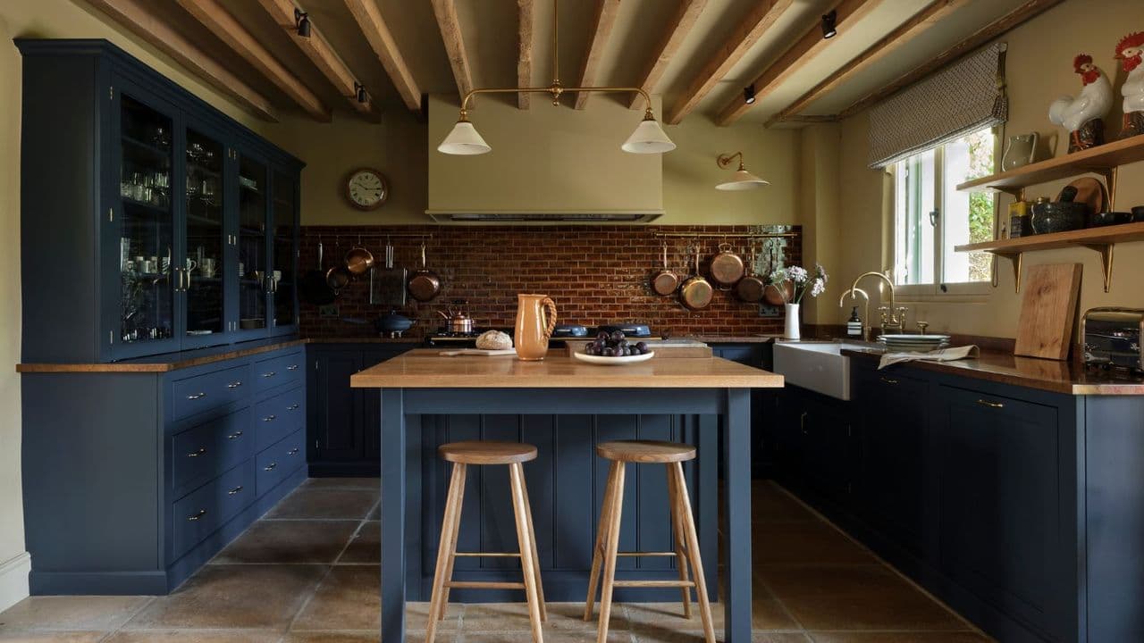
3. Deep Blue: Rooted in Landscape and Longevity
Deep, landscape-inspired blues have become a cornerstone of the luxury kitchen conversation over the past several years, and 2026 shows no sign of this changing. These are not the bright navy blues of a trend cycle but rather something more complex — shades that draw from the natural world, referencing stormy coastlines, ancient slate, and deep ocean water.
What makes deep blue feel expensive is its inherent sense of stillness and permanence. Unlike lighter or brighter shades that can feel reactive to trends, a well-chosen deep blue feels like it has always been there. Applied to kitchen cabinetry, it grounds the space and creates a striking contrast against lighter worktops, white walls, or natural stone. Polished nickel, aged bronze, and warm white marble are ideal companions.
For smaller kitchens, deep blue works especially well as an island color, allowing you to introduce the richness of the tone without committing every surface to a dark palette. This approach also creates a natural focal point and a sense of intentional design.
4. Forest Green: Organic Luxury That Endures
Forest green has proven itself one of the most enduring luxury kitchen colors of the past decade, and its staying power in 2026 is a testament to its versatility. Unlike trendy colors that peak and recede quickly, deep greens feel rooted in the natural world in a way that keeps them feeling relevant season after season.
The most expensive-looking iterations of forest green tend toward the darker, more complex end of the spectrum — shades with blue undertones or a slight smokiness that adds sophistication. These work beautifully against raw brass, matte black, and aged oak, creating a palette that feels both contemporary and classically timeless.
5. Warm Charcoal: The New Neutral With Depth
For those who gravitate toward neutrals but want something with more dimension than standard grey, warm charcoal is the 2026 answer. Unlike cool mid-tone greys that can feel sterile or corporate, a warm charcoal carries brown or green undertones that give it life and adaptability across different lighting conditions.
Applied to cabinetry, warm charcoal reads as both dramatic and refined, creating a backdrop that allows natural materials — stone, timber, leather, terracotta — to feel elevated. It pairs exceptionally well with warm metallics and matte black hardware, and holds its own in both modern and traditional kitchen schemes.
How to Choose the Right Color for Your Kitchen
Selecting a color that will make your kitchen look genuinely expensive rather than merely painted requires a few key considerations. First, always test large paint swatches in your actual space across different times of day — the same color can shift dramatically depending on your light source and orientation. Second, think about the full material palette before committing: the most successful kitchens in 2026 are those where color, texture, and hardware are considered together as a unified scheme rather than as separate decisions. Finally, do not underestimate the impact of finish. A matte or eggshell finish will almost always read as more refined and premium than high gloss, particularly for cabinetry in deep or saturated tones.
Whether you are drawn to the warmth of burgundy, the radiance of butter yellow, the depth of a landscape blue, the organic richness of forest green, or the grounded sophistication of warm charcoal, 2026's kitchen color trends offer something for every taste — and every budget. The most expensive-looking kitchens are not always the most expensive to create. More often than not, they are simply the most thoughtfully colored.