Why Your Paint Color Choice Matters More Than You Think
Color is one of the most powerful tools in interior design — and one of the easiest to get wrong. The right hue can make a room feel expansive, warm, luxurious, and deeply personal. The wrong one? It can make even an expensive space feel like it came straight off a discount shelf. According to leading interior designers, certain colors carry visual cues that read as "cheap" almost instantly, regardless of how much money you've spent on furniture or fixtures. The good news is that every one of these color pitfalls has a beautiful, elevated alternative that won't break the bank to implement.
Whether you're repainting a single room or rethinking your entire home's palette, this guide will walk you through the seven most common color mistakes designers see — and exactly what to reach for instead.
1. Stark Bright White
Pure, bright white might seem like the safest choice, but designers consistently flag it as one of the biggest color mistakes homeowners make. Stark white reflects too much light, washes out undertones in your furniture and flooring, and creates a cold, clinical atmosphere that feels more like a hospital corridor than a home.
Use instead: Opt for warm off-whites and soft whites with creamy or greige undertones. Shades like Benjamin Moore's "White Dove" or Sherwin-Williams' "Alabaster" add warmth and depth while still keeping rooms feeling bright, airy, and effortlessly elegant.
2. Neon or Overly Saturated Accent Colors
Bold accent walls can be done beautifully, but when the color chosen is neon yellow, electric teal, or a highly saturated orange, the result tends to look jarring and low-cost. These shades are difficult to pair, rarely age well, and can visually overpower every other element in the room.
Use instead: Choose deeply saturated but sophisticated jewel tones. A rich sapphire blue, a moody forest green, or a deep terracotta bring bold personality to a space without the visual chaos. These colors photograph beautifully and feel intentional rather than accidental.
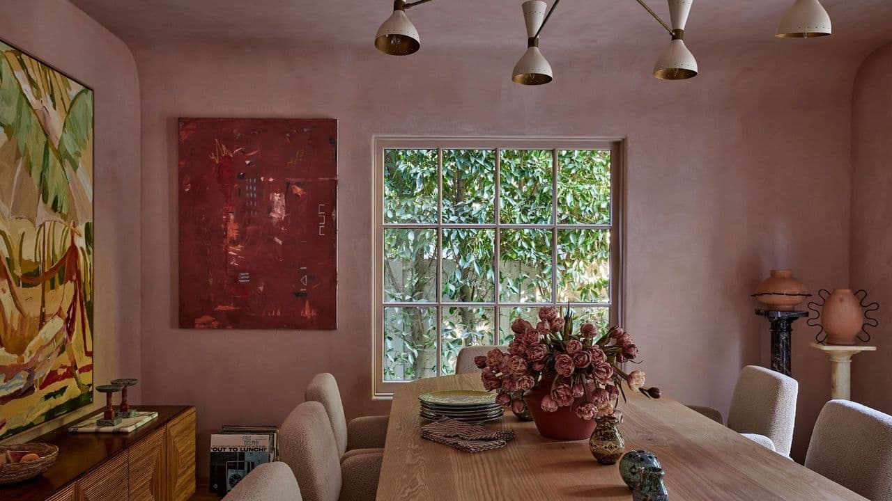
3. Beige with Pink Undertones
Not all beiges are created equal. The variety with strong pink or peach undertones — sometimes called "builder beige" — has become synonymous with outdated, uninspired interiors. This tone tends to clash with wood flooring, white trim, and most furniture colors, creating a muddy, confused palette.
Use instead: Look for beiges and taupes with gray or warm yellow undertones. Shades like "Accessible Beige" by Sherwin-Williams or "Edgecomb Gray" by Benjamin Moore sit effortlessly alongside a wide range of finishes and feel current without being trendy.
4. Canary Yellow
Yellow is a cheerful, energetic color — but the wrong shade can make a room feel harsh and budget-looking. Bright canary or lemon yellow reflects a sharp, cold light that's unflattering on skin tones and tends to feel more playroom than living room, regardless of how sophisticated the surrounding décor might be.
Use instead: Reach for muted, earthy yellows with ochre or mustard undertones. These warm, nuanced shades bring the optimism of yellow to a space while grounding it with a sense of age and sophistication that feels curated and timeless.
5. Flat Gray
The all-gray interior trend had its moment, but flat, cool gray — especially when used throughout an entire home — now reads as dated and somewhat sterile. Without warm undertones or complementary textures, gray can make a space feel lifeless and uninviting, like a showroom no one actually lives in.
Use instead: If you love the ease and neutrality of gray, look for versions with warm undertones that lean toward greige or soft lavender. Better yet, introduce warmth through natural materials like wood, linen, and leather alongside your gray palette to give it life and dimension.
6. High-Gloss Colors on Walls
High-gloss paint has its place in interior design — on trim, cabinetry, or front doors — but when applied to walls, particularly in strong colors, the result often looks cheap and garish. The sheen highlights every imperfection in the wall and creates an almost plastic-like appearance that undermines the overall look of the room.
Use instead: Choose eggshell or matte finishes for walls. These finishes are practical, subtle, and allow the color itself to be the star of the show rather than the reflective quality of the paint. Reserve gloss for architectural details where it truly shines.
7. Mismatched Greens Without a Unifying Base
Green is having a well-deserved moment in interior design, but combining multiple green tones without a clear strategy can look chaotic and unresolved. Mixing a cool sage with a warm olive and a bright lime, for example, creates visual conflict that makes a room feel busy and unplanned.
Use instead: Choose one green family and build within it. Deep hunter greens, sophisticated sages, and dusty eucalyptus tones all work beautifully on their own or with neutrals, as long as the undertone family stays consistent throughout the room.
The Bigger Picture: How to Choose Colors That Elevate Your Home
Beyond avoiding these common pitfalls, the most important thing you can do is test before you commit. Paint large swatches on your walls and observe them at different times of day. Consider the natural light in your room, the undertones in your flooring and furniture, and the mood you want the space to create. A color that looks perfect in a design magazine may behave completely differently in your specific home.
Great color choices aren't always about expensive paints or trending palettes. They're about understanding how color works in light, how it interacts with your existing elements, and how it makes you feel when you walk through the door. With a little knowledge and the right alternatives in hand, elevating your home's look can be as simple as picking up a paintbrush.