The Counterintuitive Truth About Beautiful Spaces
Walk into a room that takes your breath away. Chances are, your first instinct is to figure out what's in it — the furniture, the lighting, the textures. But if you look more carefully, what you're actually responding to is what isn't there. The breathing room between objects. The uninterrupted wall. The single, deliberate piece of art that doesn't compete with anything else for your attention.
Great interior design has always been as much about subtraction as it is about addition. In an era of endless product options, trend cycles, and social media inspiration boards, this truth is more important — and more difficult to embrace — than ever before. When everything demands attention, nothing truly stands out. And that principle is the foundation of every truly memorable interior.
Why We Default to Adding More
There's a deeply human impulse behind accumulation. We associate fullness with abundance, with care, with personality. An empty shelf feels neglected. A bare wall feels unfinished. We fill spaces not just with objects, but with meaning, memory, and identity. This is natural — but when left unchecked, it leads to rooms that feel visually exhausting without anyone quite understanding why.
The design industry compounds this tendency. Retail environments are structured to make you feel like you need one more throw pillow, one more side table, one more decorative tray. Trends change seasonally, encouraging constant replacement and layering. The result is a culture of interiors that are busy, contradictory, and ultimately unsatisfying — because they never allow any single element to breathe, to speak, or to land with impact.
Professional interior designers understand this problem intimately. Many will tell you that their most important skill is not knowing what to place in a room, but knowing what to take out of it.
The Visual Hierarchy Problem
Every element in a room competes for visual attention. Your eye naturally moves through a space in search of a resting point, a focal hierarchy that tells it where to go and what matters. When too many objects occupy that same visual field — all of similar weight, scale, or visual noise — the eye becomes fatigued. There's no hierarchy. There's no story. There's just chaos with a color palette.
This is why interior design is deeply related to graphic design and visual communication. In typography, designers know that if you bold everything, nothing is bold. The same logic applies to physical space. A dramatic sculptural lamp only reads as dramatic when it isn't surrounded by five other things fighting for the same status. A beautiful piece of furniture only commands attention when the space around it is allowed to be quiet.
Removing excess isn't about making a room feel cold or sparse. It's about restoring visual hierarchy so that the things you love actually get to be loved — seen, appreciated, experienced — rather than lost in a sea of visual competition.
What Subtraction Actually Looks Like in Practice
Embracing a subtractive approach to interior design doesn't require becoming a minimalist or abandoning everything that feels personal. It requires developing a more intentional eye. Here are the areas where thoughtful removal consistently produces the most dramatic results:
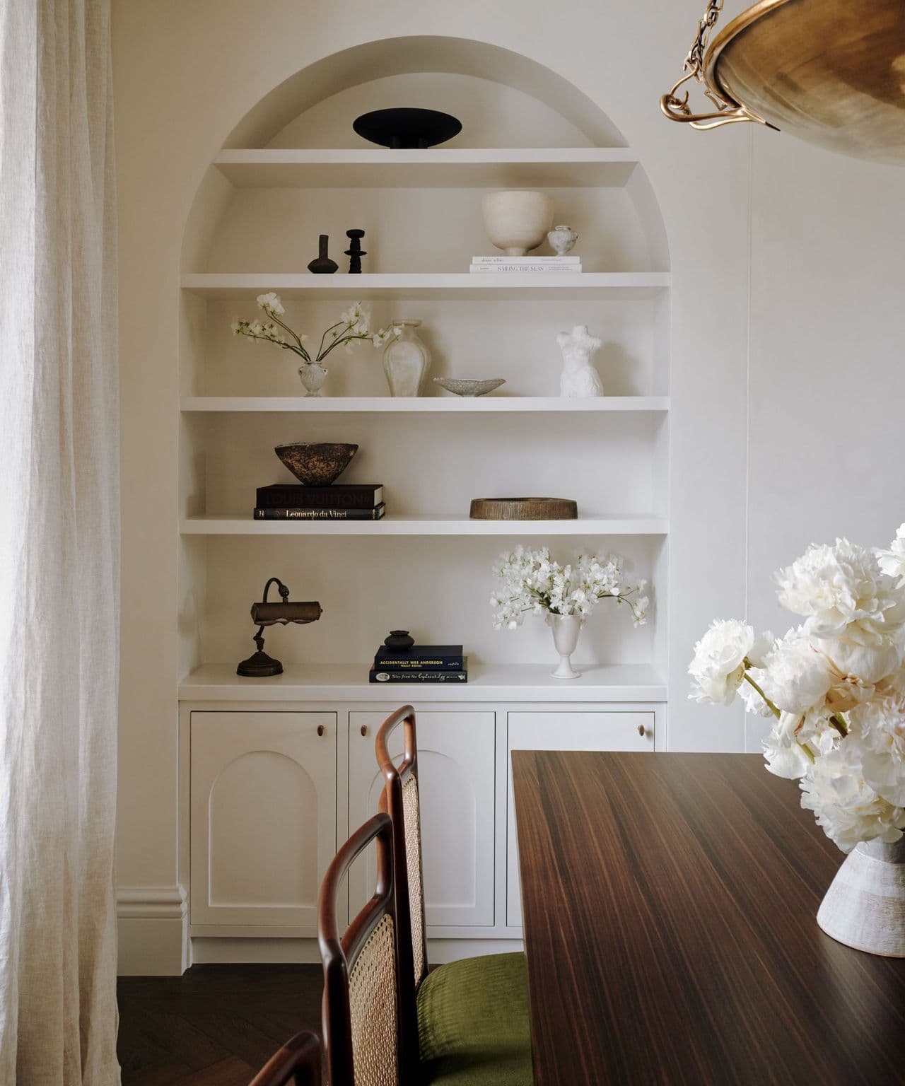
- Surface editing: Tabletops, counters, and shelves are the most common sites of visual clutter. Reducing the number of objects on any given surface — even by half — almost always improves the overall composition of a room. A shelf with five carefully chosen objects reads as curated. A shelf with twenty reads as storage.
- Furniture scale and count: Many rooms are simply over-furnished. Removing one piece of furniture — an extra side chair, a redundant console table — can instantly open up flow, improve proportion, and make the remaining pieces feel more intentional and significant.
- Competing focal points: When a room has a fireplace, a large piece of art, a bold rug, and a statement sofa all vying for attention simultaneously, the space feels incoherent. Deciding which element is the hero — and subordinating everything else to support it — transforms the energy of the entire room.
- Color noise: More colors do not mean more personality. A room with seven accent colors feels restless. Reducing to two or three, even if they're bold, creates a composition that the eye can read and settle into.
- Decorative excess: Not every surface needs decoration. Not every corner needs an object. Allowing negative space — literal emptiness — to exist in a room is one of the most sophisticated design moves available, and one of the rarest in real homes.
Negative Space as a Design Element
In art and architecture, negative space is the empty area surrounding a subject. It is not wasted space. It is active space — it defines the subject, gives it room to exist, and shapes the viewer's emotional response to it. The same principle applies inside your home.
A blank wall beside a beautiful piece of furniture is not a design failure. It is the silence that makes the furniture audible. A clear countertop beside a single object of craft gives that object room to be noticed, studied, appreciated. Negative space is not emptiness — it is intention.
The designers whose work endures across decades, from the quiet precision of Scandinavian interiors to the restrained luxury of Japanese wabi-sabi aesthetics, all share this understanding. They don't fill space because they're afraid of it. They protect space because they understand its value.
Reframing the Edit as an Act of Care
There's a meaningful shift that happens when you stop thinking of editing your space as a loss and start thinking of it as an act of curation and care. When you remove the objects that don't belong, the ones that remain become more meaningful. The room becomes more yours, not less — because what stays has been chosen deliberately rather than simply accumulated over time.
This is perhaps the deepest truth about subtractive design: it is an act of commitment. It requires you to decide what actually matters, what you actually love, and what genuinely belongs in the life you're trying to build. That is harder than buying something new. But the spaces it produces — calm, clear, considered — are the ones people never want to leave.
Start Removing Before You Buy Anything Else
The next time your space feels off and your instinct is to buy something new, pause. Walk through each room and ask a different question: what can I take away? Remove one piece. Edit one shelf. Clear one surface. Then live with it for a week before deciding anything else.
You may find that the room you were looking for was already there — it was just waiting for you to get out of its way.