Why Color Is the Most Powerful Design Tool You Have
You don't need a six-figure renovation budget to make your home look like it belongs in an interior design magazine. According to top designers across the industry, the single most transformative — and most affordable — upgrade you can make to any space is choosing the right paint color. The right shade doesn't just change the way a room looks; it changes the way a room feels. It can suggest depth, sophistication, warmth, and intentionality. The wrong color, no matter how beautiful your furniture or how expensive your fixtures, can make even a well-appointed room feel flat and forgettable.
So what exactly are the colors that signal luxury? We've gathered insights from leading interior designers to break down the specific shades, tones, and palettes that will make your home look instantly more expensive — and explain exactly why they work.
The Psychology Behind "Expensive-Looking" Colors
Before diving into specific shades, it helps to understand the underlying principle. Colors that read as expensive tend to share a few key characteristics. They are typically complex, meaning they carry undertones that shift subtly in different lighting conditions. They avoid the overly saturated, one-dimensional look of basic paint-chip colors. They feel considered rather than default. Designers consistently point to colors that sit in the middle ground — neither too light nor too dark, neither too warm nor too cold — as the sweet spot for sophistication.
It's also about restraint. Colors that look expensive rarely scream for attention. Instead, they create a quiet confidence that allows the architecture and furnishings of a space to shine.
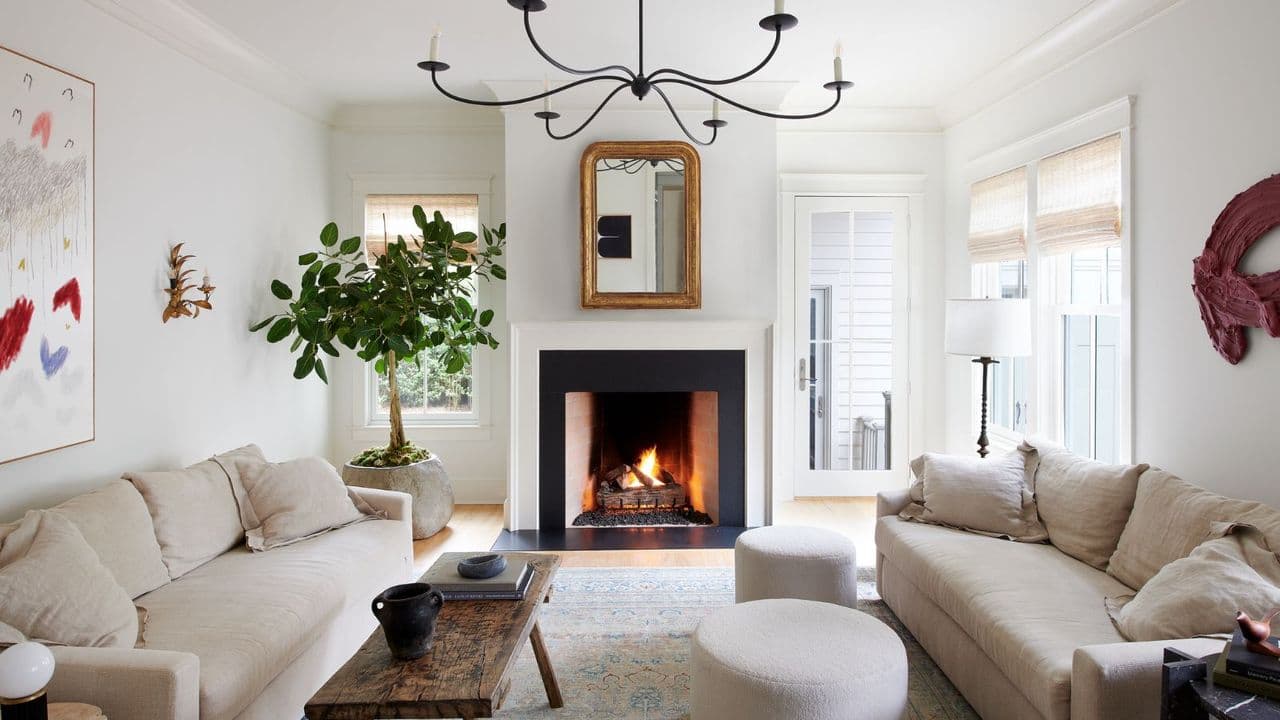
Warm Whites and Creamy Neutrals
The most universally agreed-upon "expensive" color is not actually a color at all — it's a carefully chosen white. But not just any white. Designers are emphatic that stark, bright whites can feel clinical and cheap. The whites that elevate a home are warm, creamy, and slightly off-tone. Think shades like Benjamin Moore's White Dove, Farrow & Ball's Pointing, or Sherwin-Williams' Alabaster. These whites have just enough warmth to feel welcoming and intentional without veering into yellow.
Creamy neutrals in this family work beautifully on walls, trim, and ceilings alike — and when used consistently throughout a space, they create a seamless, gallery-like flow that is the hallmark of high-end interior design.
Deep, Saturated Darks
On the opposite end of the spectrum, very deep colors — used with confidence — are one of the fastest ways to make a space look expensive. Designers frequently reach for rich navy blues, forest greens, charcoal grays, and deep aubergines when they want to create drama and gravitas. Colors like Farrow & Ball's Hague Blue, Studio Green, or Railings have become shorthand for a certain kind of cultivated, moody sophistication.
The key to making dark colors work is commitment. Half-measures rarely succeed — a dark color applied timidly to a single accent wall often looks unresolved. However, painting an entire room, including the ceiling and trim, in the same deep shade creates an enveloping, jewel-box effect that feels undeniably luxurious.
Earthy, Complex Neutrals
The biggest shift in interior color over the past decade has been the move away from gray — which dominated the 2010s — toward warmer, earthier tones. Putty, greige, taupe, sand, and clay shades now dominate high-end interiors, and for good reason. These colors have a natural complexity that changes beautifully throughout the day as light shifts. They feel grounded and organic rather than trendy.
- Greige tones like Sherwin-Williams' Accessible Beige or Benjamin Moore's Pale Oak bring warmth without feeling dated.
- Clay and terracotta shades add richness and an artisanal quality that reads as collected and intentional.
- Putty and mushroom neutrals — soft, slightly gray beiges — are particularly popular in European interiors and feel effortlessly elevated.
- Warm taupes serve as sophisticated all-day neutrals that work with both modern and traditional furnishings.
Soft Sage and Muted Greens
Green has emerged as one of the defining colors of contemporary luxury interiors. But not all greens are created equal. The greens that look expensive are muted, dusty, and complex — think sage, eucalyptus, olive, and moss rather than bright or lime green. These shades have a strong botanical reference that feels both timeless and current, and they work exceptionally well in kitchens, bedrooms, and living spaces.
Farrow & Ball's Mizzle, Mould, and Pigeon are frequently cited by designers as go-to options. These colors are desaturated enough to function almost like a neutral while still bringing a distinct, recognizable character to a space.
The Role of Finish and Application
Even the most expensive-looking color can fall flat if applied incorrectly. Designers are unanimous on this point: the finish matters as much as the color itself. For walls in living areas and bedrooms, a flat or matte finish absorbs light beautifully and hides imperfections, giving a surface a depth and solidity that eggshell or satin finishes cannot match. High-gloss finishes, used selectively on trim, cabinetry, or ceiling details, create a polished contrast that feels intentional and refined.
Application quality is equally important. Multiple thin coats, proper priming, and meticulous edge work are what separate a professional-looking paint job from an amateur one — and it's often these details, more than the color itself, that signal whether a home has been cared for with intention.
Pulling It All Together: A Cohesive Palette
Individual colors matter, but what truly makes a home look expensive is a cohesive, thoughtful color story throughout the entire space. Designers recommend choosing two to three anchor colors and layering them consistently from room to room, allowing each space to feel distinct while still connected. Avoid jarring transitions or isolated accent walls that feel disconnected from the rest of the home.
The homes that look the most expensive are rarely the ones with the most dramatic single room — they're the ones where every room feels considered, every transition feels intentional, and every color feels like it belongs exactly where it is. With the right palette and a little confidence, that level of sophistication is available to anyone, at any budget.