The Rise of 'Dirty' Kitchen Colors in 2026
Something significant is happening in kitchen design, and it smells faintly of damp earth, warm clay, and aged wood — in the very best way. The long reign of the all-white, clinically clean kitchen is coming to a close, and in its place, a richer, more characterful palette is stepping into the spotlight. Designers are calling these hues "dirty" kitchen colors, and far from being an insult, the term is quickly becoming one of the most exciting compliments a kitchen can receive.
From mossy greens and muddy browns to deep terracotta and smoky ochre, these muted, earthy tones are redefining what a stylish kitchen looks like in 2026. If you've grown tired of spaces that feel more like a hospital corridor than a home, this trend is the antidote you've been waiting for.
What Exactly Are 'Dirty' Kitchen Colors?
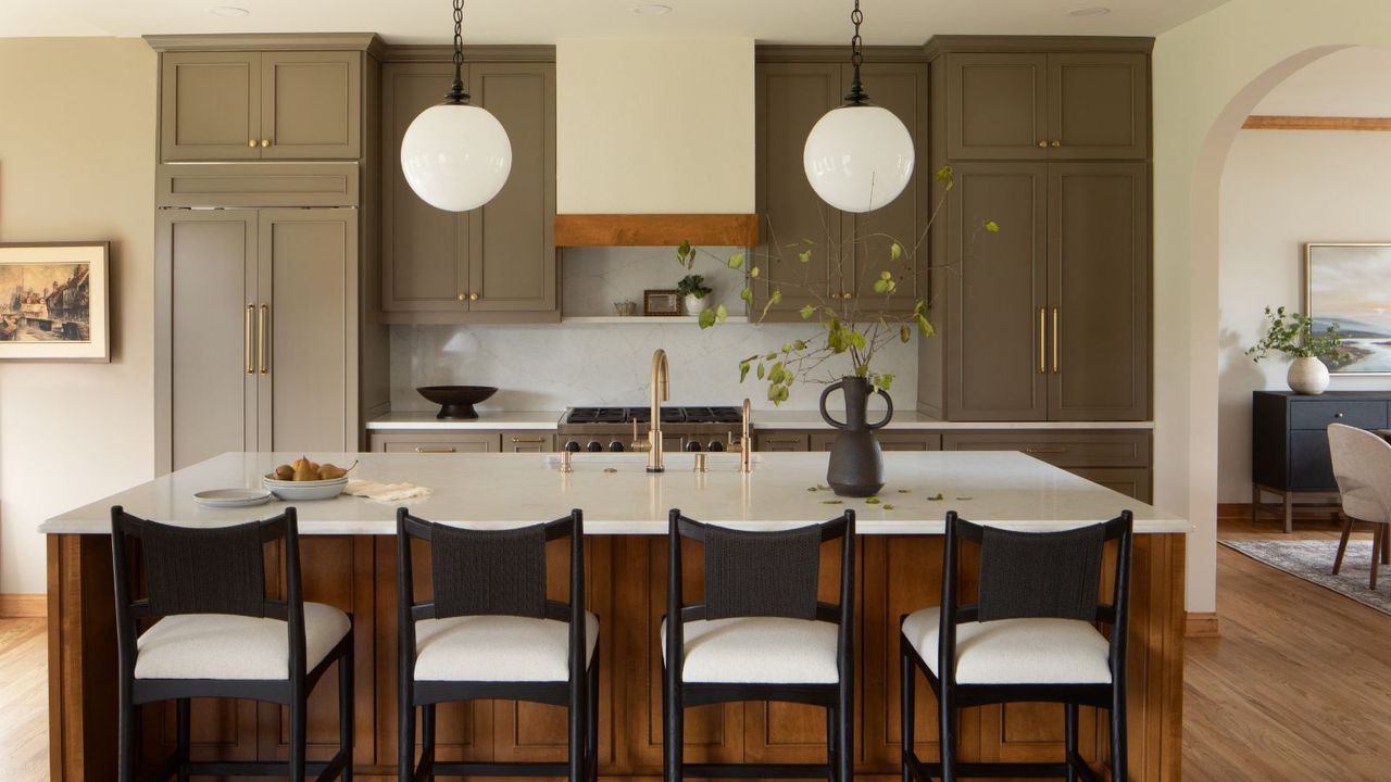
The phrase might raise an eyebrow at first, but the concept is immediately understandable once you see it in action. Dirty kitchen colors are shades that carry depth, complexity, and a sense of age or patina. They are not the flat, bright, or saturated tones of trend-driven palettes past. Instead, they sit closer to the natural world — think the color of forest floors, river clay, aged terracotta pots, and stone walls weathered by decades of rain.
These are colors with a story. They include:
- Mossy greens — soft, grey-tinged greens that evoke woodland and calm
- Muddy browns — warm, amber-inflected neutrals that anchor a space beautifully
- Deep terracotta — sun-baked, rusty tones that bring Mediterranean warmth indoors
- Smoky ochres — golden yellows dulled to a sophisticated, aged finish
- Dusty plums and muted sages — unexpected tones that add personality without shouting
What unites them is a sense of restraint. These are not colors that demand attention — they earn it, slowly and confidently, the way a well-worn leather armchair does in a room full of flat-pack furniture.
Why Designers Are So Excited About This Trend
Interior designers have been nudging clients away from stark white kitchens for several years now, and in 2026, they finally have the cultural momentum to make it stick. According to design professionals, the appeal of dirty kitchen colors goes beyond aesthetics — it's about how a space makes you feel.
Nicole Forina of Forina Design & Co. puts it eloquently: "The appeal comes from a desire for warmth and depth that stark white or overly saturated colors sometimes lack. These muted, earthy tones feel grounded, cozy, and incredibly sophisticated. They move away from fleeting trends and lean into a timeless, collected aesthetic. They feel authentic and less sterile than some modern finishes."
That word — authentic — is key. At a time when people are increasingly aware of how manufactured and disposable so much of modern life feels, there is a growing appetite for things that feel real, lived-in, and lasting. A kitchen painted in a rich, complex muddy green doesn't look like it came from a showroom. It looks like it belongs to someone with taste, history, and a genuine relationship with their home.
In many ways, this is an anti-trend. Rather than following the herd toward whatever color a big-box retailer is promoting, homeowners are choosing palettes that feel personal and meaningful. Dirty kitchen colors signal an intentional rejection of the status quo, and that kind of quiet confidence is enormously appealing.
How to Get 'Dirty' Kitchen Colors Right
The most important principle when working with these muted, earthy tones is to think tonally. One of the most common mistakes is pairing a beautiful muddy cabinet color with a crisp, brilliant white wall — the contrast is too jarring and undermines the cohesive, layered feel that makes dirty palettes so compelling.
Instead, look to layer softer shades that sit comfortably within the same tonal family. A muddy terracotta cabinet, for instance, pairs beautifully with a warm off-white or a faded blush on the walls. Mossy green cabinetry works wonderfully alongside aged brass hardware and a backsplash in a soft, creamy stone. The goal is harmony, not contrast.
Pairing Colors and Materials
Dirty kitchen colors work especially well when paired with natural materials that share the same earthy sensibility. Rough-hewn oak, brushed limestone countertops, unlacquered brass taps, and handmade ceramic tiles all complement muted palettes in a way that polished chrome and glossy surfaces simply do not. The texture of the materials reinforces the depth of the color, and together they create a kitchen that feels genuinely luxurious — not in a cold, showroom sense, but in the way that a farmhouse kitchen in Tuscany feels luxurious.
Scale and Light Considerations
A concern many homeowners have about moving away from white is losing a sense of space and light. The good news is that dirty kitchen colors, used thoughtfully, do not make a room feel smaller. In fact, the depth and warmth they introduce can make a kitchen feel more enveloping and intimate in a positive way. To prevent a space from feeling closed-in, ensure you have adequate natural and artificial light, and consider using your chosen dirty tone only on lower cabinetry while keeping upper cabinets in a related but lighter shade.
Is This a Trend or a New Permanent Fixture?
One of the most persuasive arguments for embracing dirty kitchen colors is their longevity. Unlike the bright accent colors or ultra-glossy finishes that swept through kitchen design a decade ago and already feel dated, earthy and muted tones have an inherently timeless quality. Terracotta has been a beloved architectural color for thousands of years. Mossy greens and warm browns appear in the most enduring interiors across centuries and cultures.
This is not a trend that will feel embarrassing in five years' time. It is, instead, a shift toward a more considered, more human way of designing kitchens — one that values warmth, depth, and personality over the superficial cleanliness of a purely aesthetic exercise. Dirty kitchen colors are here to stay, and the sooner you embrace them, the sooner your kitchen will feel less like a backdrop and more like a place where real life — wonderful, messy, delicious real life — actually happens.